
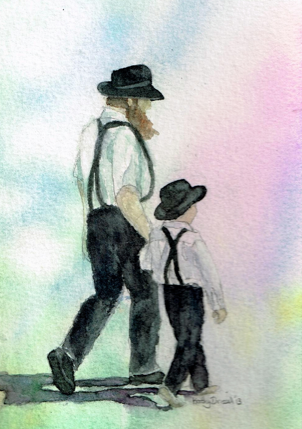
In January I took part in the WetCanvas Watercolor Challenge January 2013. I live only an hour and a half away from Lancaster, and have often visited this lovely area. I was really pleased with the way this small painting turned out.
5 x7
Winsor & Newton Paints (Winsor Blue, Quinacridone Magenta, Permanent Rose, Hooker’s Green, Cobalt Blue, Burnt Sienna and Naples Yellow)
Arches 300 lb Cold Press Paper
You can see the work of the other participants here: Wet Canvas January 2013 Watercolor Challenge.
My work was posted on page nine of the thread.
Why not try the February challenge? The WetCanvas Forums are free. Find the link to WetCanvas in the top right hand corner of this page. You can also go directly to the Challenge through this link: Wet Canvas February 2013 Watercolor Challenge. It’s as easy as signing up and beginning to paint.
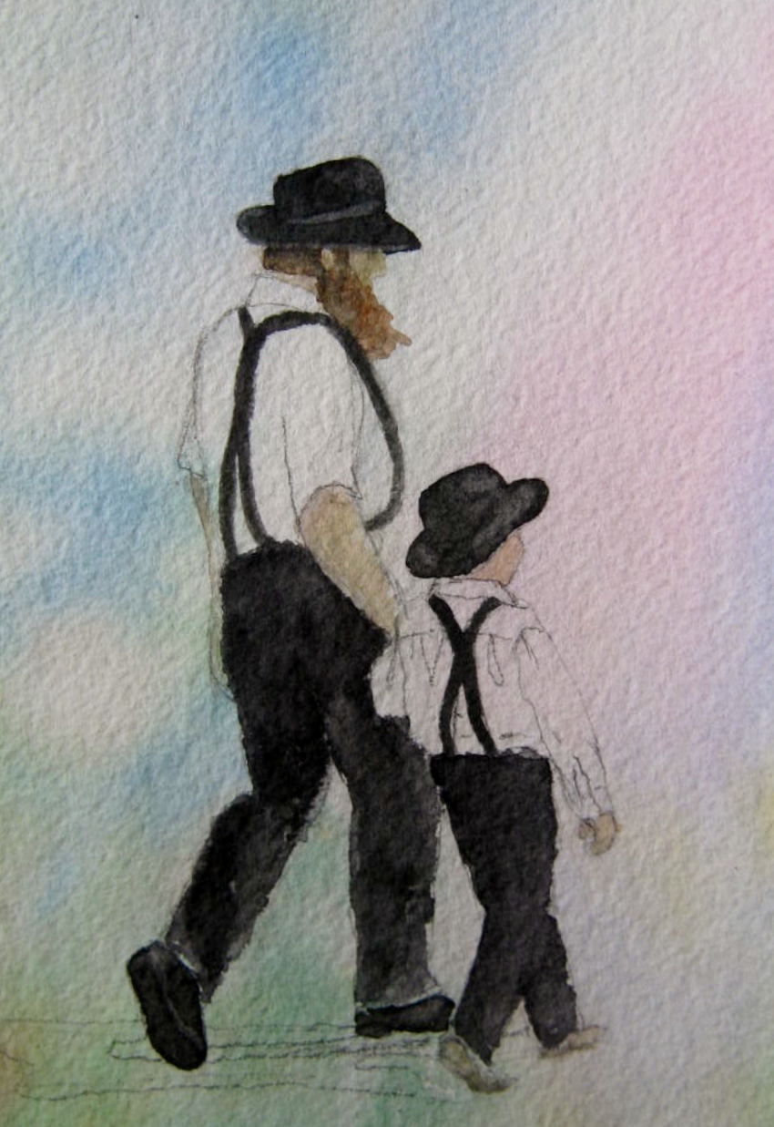
You can find my step-by-step progress below.
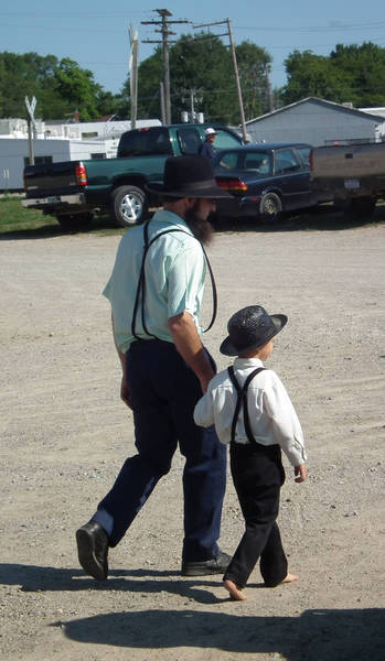
Original reference photograph posted by Yorky


Watercolor Tip: Black out of the tube is usually flat and lifeless. Mix up your own blacks and deep tones by combining contrasting colors.
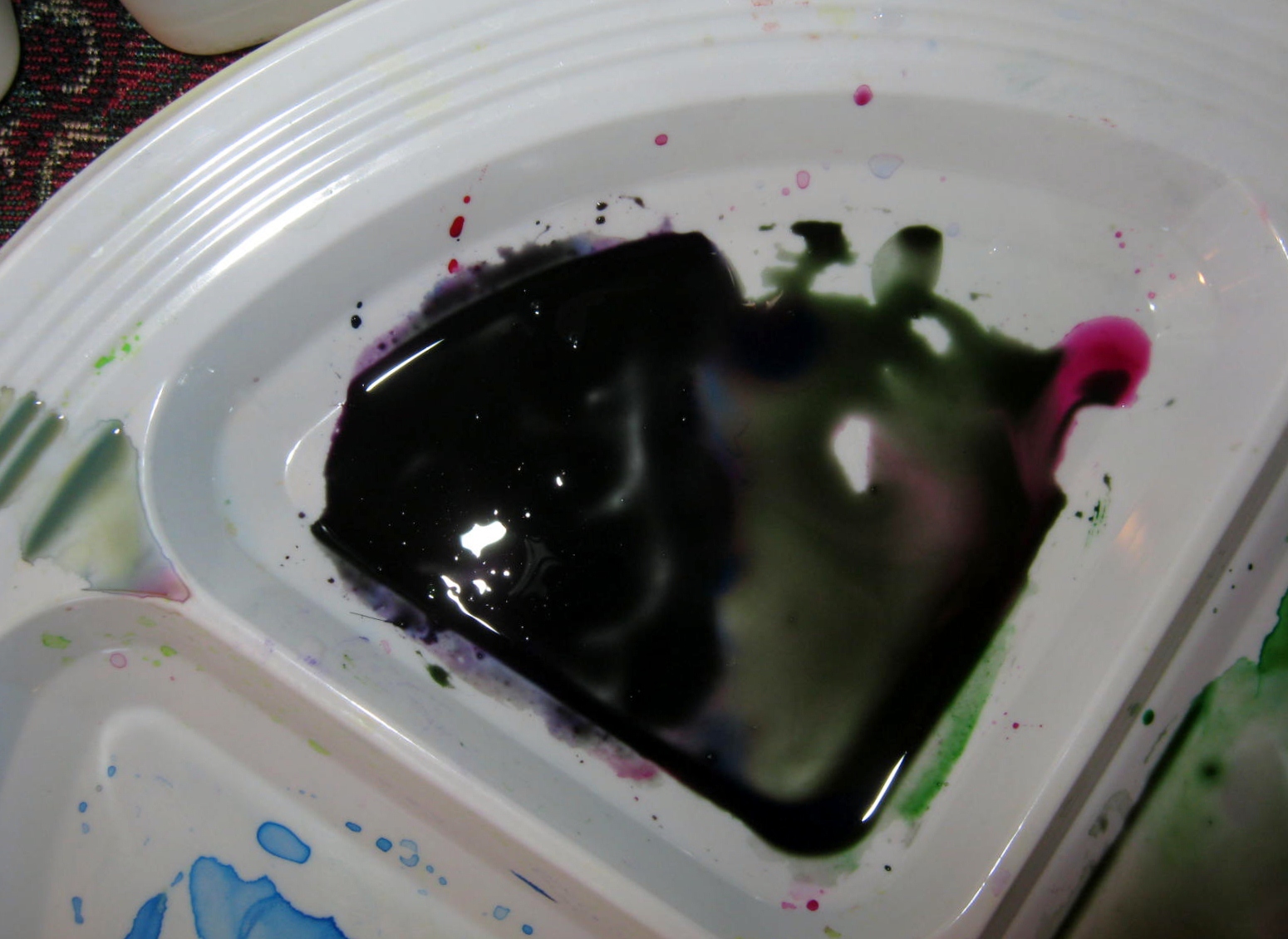
I mixed Hooker’s Green, Quinacridone Magenta, and Winsor Blue, and even a bit of yellow. You can pick out the different hues of colors blending together in the thinner areas of paint, notice the deep tone they create when mixed together.


