Today I discovered that Jennifer Nichole Wells is running her Color Your World – 120 Days of Crayola challenge again. I enjoyed taking part in this last year, and hope to create several posts that fit in with many of the Crayola color themes.
The color of the day is Burnt Sienna. This is one of my favorite colors to use when painting in watercolor. Burnt Sienna brings an earthiness to any color it is mixed into.
A good example of burnt sienna in nature is fallen leaves, much like these my backyard squirrels have woven into their winter nest.

Seen from a distance, this nest appears precarious. Perched on the end of a trimmed branch it seems likely to fall.

When I zoom in with my camera though, I see it is a masterful design, the leaves held in place by dozens of small twigs that have sprouted from the cut end. What a great squirrel condo, and also a good example of the many tones of burnt sienna. I would love to take a peek inside at the interior of the nest.

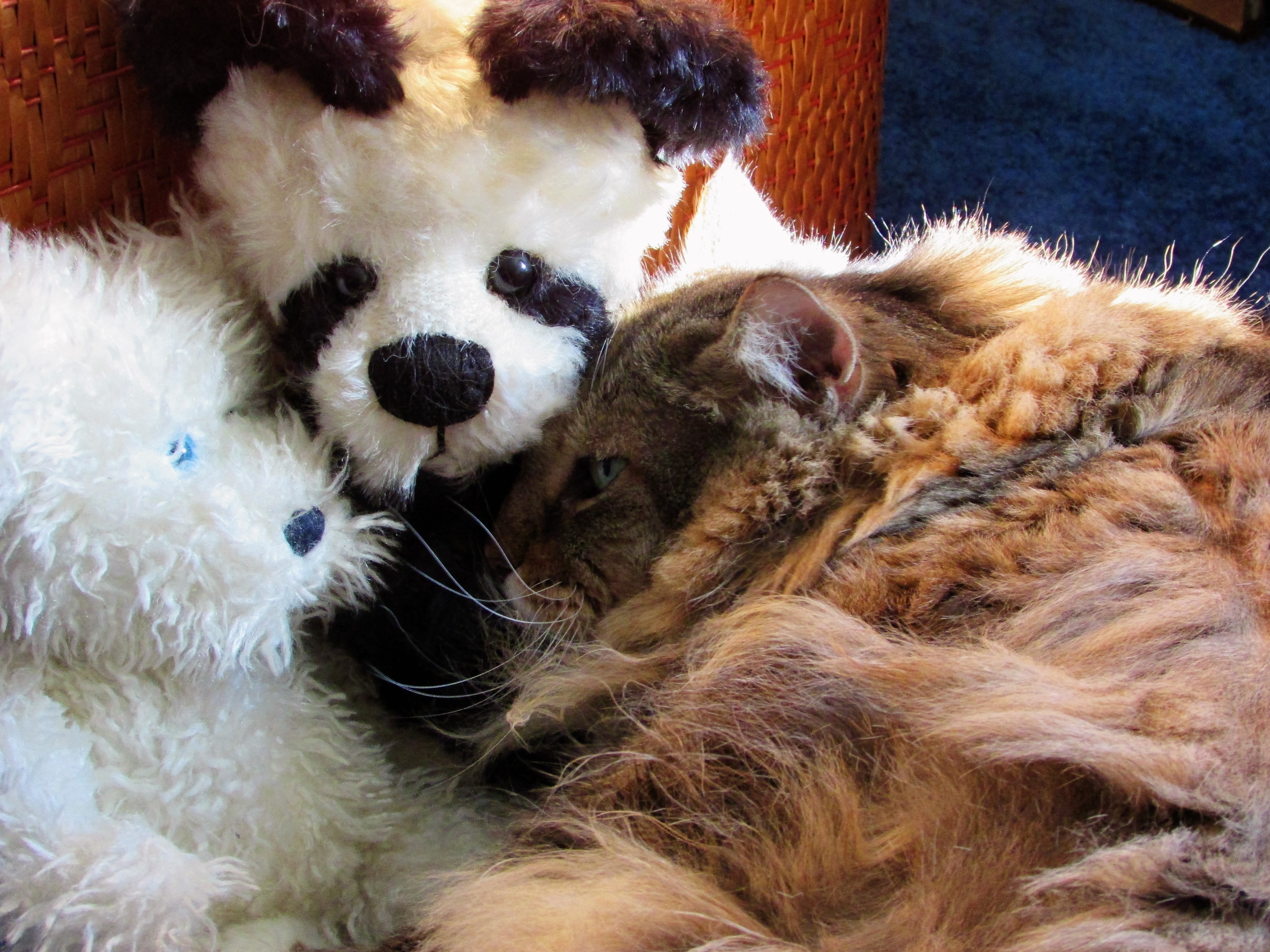
I’m also adding another photo of our friendly neighborhood biscuit-loving dog. He is definitely blessed with a heavy coat of burnt sienna…many tones of brown and orange make up his fur. My blogging friend SusieShy asked me if he was a stray. I was able to say no, with surety, since he is wearing a Christmas kerchief around his neck.