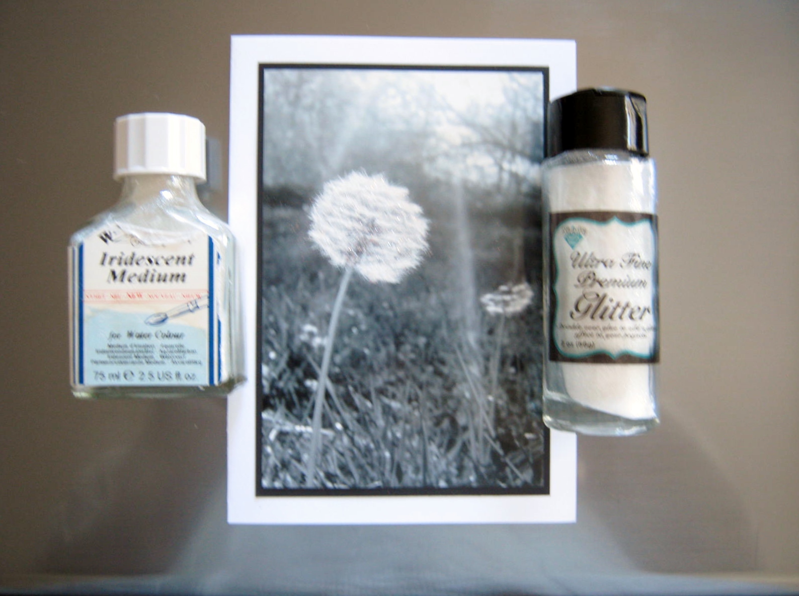

As I grow older, I want to be a person who rambles on less, choosing instead my words with care. For instance, a good example is the pressed flower card I’ve pictured above. On closer examination of the background page I noticed I had not read through the paragraphs from ‘Alice in Wonderland‘ and at the top was a phrase about an ignorant little girl. How careless of me, I would feel awful if someone bought this, or if I gave it to a person dear to me, and found out afterwards they wondered if what initially seemed good was really a backhanded insult.

I will probably make more cards in the Spring, but this time I will read every word on the page before I create the finished product. I won’t throw this card away. I still feel it is beautiful, and I will frame it, and place it in my work area, a reminder that insult disguised with beauty is still an insult underneath.
The more the words, the less the meaning, and how does that profit anyone? ~Ecclesiastes 6:11
These cards are easy to make. Use old classic books you don’t mind cutting up, and a background color. Cut the background color to 4.5 x 6.5 inches, the book page or upper background to 4 x 6 inches. If you don’t have pressed flowers you can use garden catalog flowers to create your design. Fun to make…and a handmade card is always a joy to receive. To make a card out of card stock cut the sheet to 10 inches by 7 inches. Sometimes folding the card is difficult. It’s always a good idea to measure across five inches, place a ruler where the fold will go, and run a credit card along the ruler on top of the cardstock. This makes a small indentation that helps create a crisp, non-wrinkled fold.