Painting – WetCanvas April Challenges

IMG_0080

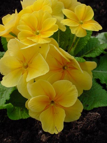
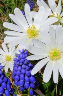
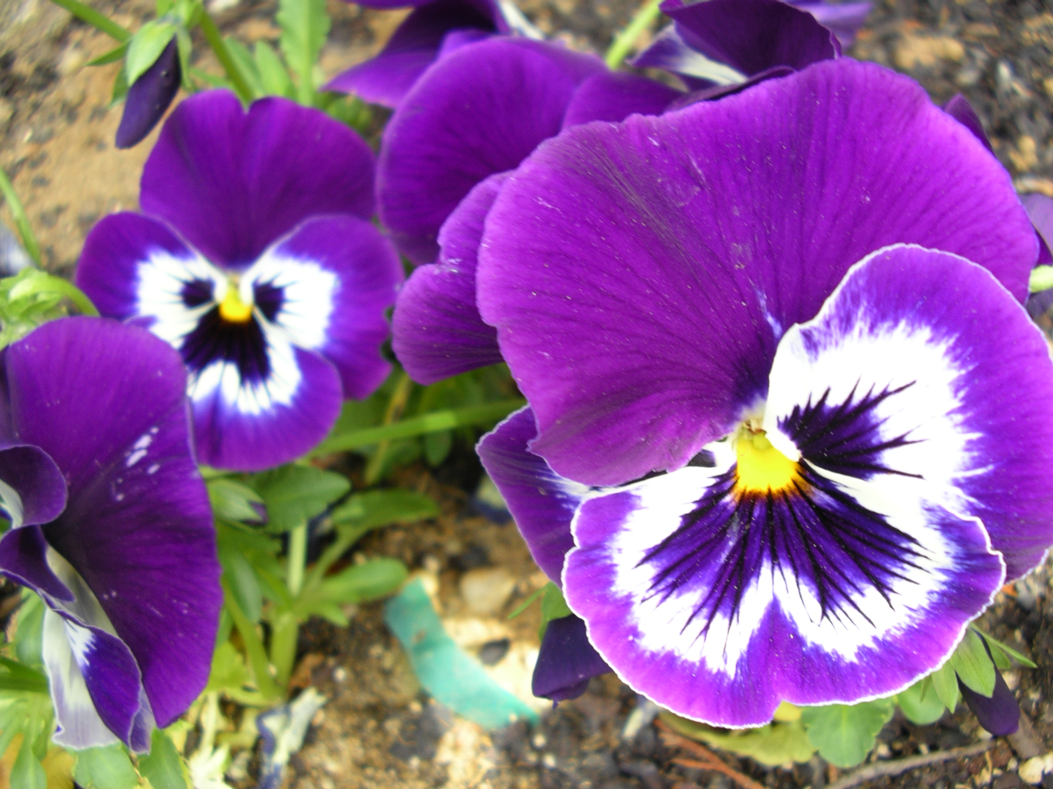
I am hoping to take part in two WetCanvas Challenges this month.  Sharron, in the Floral and Botanical Forum has chosen Anemones (Windflowers) as the subject this month. There are several lovely reference photographs to choose from in the forum along with many others in the WetCanvas Reference Library.

Any artist may participate, any medium, any approach…….2D, 3D, mixed and collaged if you wish.

I’m hoping to paint at least one anemone, maybe even two this time. I think it would be fun to try a technique completely new to me that would stretch my creativity a bit.

You can find the thread and several reference photographs here: April 2014 Plant Parade

border

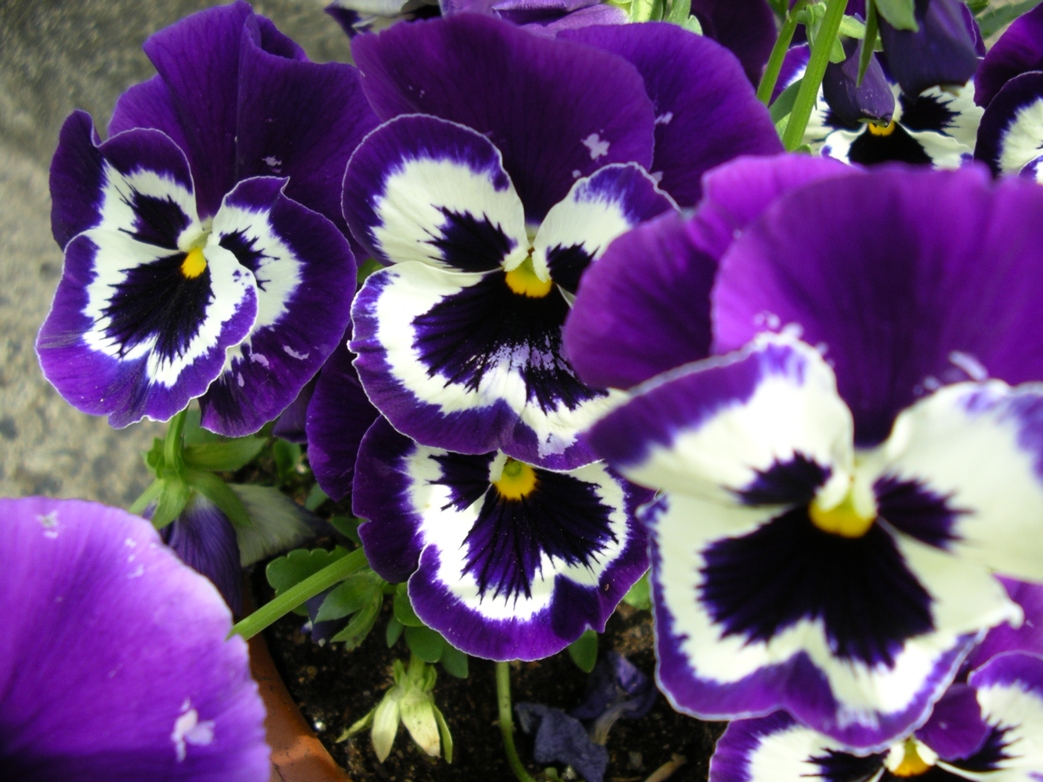
Yorky (Doug) has chosen a floral border from his own garden as the subject for this month’s Watercolor Studio Challenge.

You can find the thread here: Watercolor Studio April Challenge – Floral Border

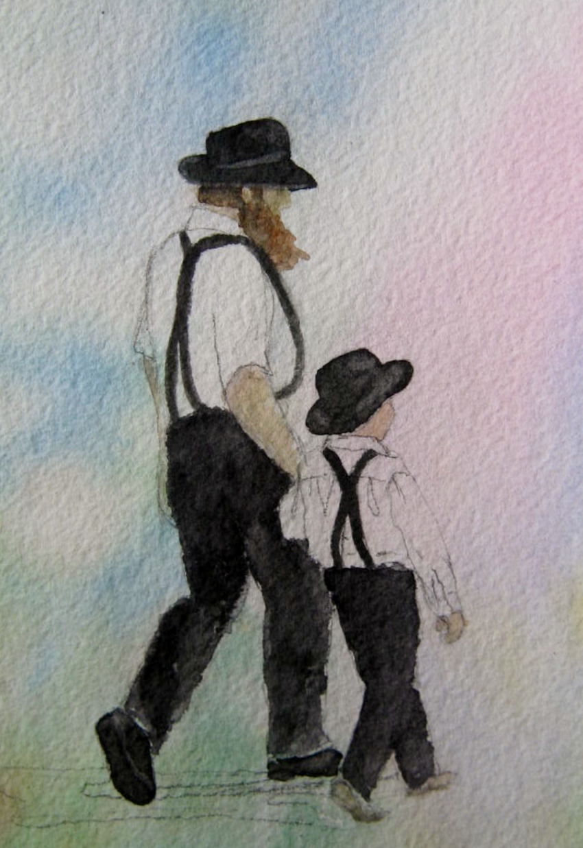
I definitely see a cat appearing somewhere in my painting. I am hoping to have the time to take part in both of these challenges. Give either or both a try if the thought of capturing the essence of the photos in artwork wraps your brain in a state of creative euphoria. Happy Creating!

Painting – WetCanvas March 2014 Plant Parade

IMG_0221

Primroses are a favorite of mine at this time of the year. When the Wetcanvas Floral and Botanical forum chose primroses as their Plant Parade subject for March, it was an easy decision to dig out an old reference photograph and join in the creating of some floral art.

You can see the many interpretations of primroses here: WetCanvas March 2014 Plant Parade

The Plant Parade allows any type of art medium in the creation of the month’s flower. So all you artists at heart, whether you draw daily or haven’t picked up a sketchbook for decades, break out your pencils, paints, collage fabrics, etc. Whatever your medium, April is a perfect month to create a few flowers.

WetCanvas is a terrific site for every type of art under the sun. Take a few moments and browse their many subject areas.

*I always include an inchworm in my floral paintings…can you find it?

Phlowers & Painting – Primrose Part II

must create yellow primula

Yellow Primula by MustCreate

For those who like to paint/draw/craft all types of Flowerart, check out the WetCanvas March 2014 Plant Parade Challenge: March 2014 The Plant Parade – Primrose/Primula. The reference photograph for the beautiful primrose above, courtesy of the WetCanvas Reference Library and MustCreate, along with many others can be found on the WetCanvas site and used copyright-free for artwork. Happy creating!

Painting – Wetcanvas The Floral/Botanical February 2014 Project

8880dscf0490__2_

This gorgeous, copyright free, macro photograph, shared by al22 in the WetCanvas Reference Library, is February’s Floral/Botanical challenge. The beauty of this flower is almost indescribable. It’s easier to just say, “Ahhh…” than try to put what you feel into words. Take a look at the link I’m including to this challenge. Better yet, peruse the whole WetCanvas website. This is one of the best sites on the web for artists of all kinds.

WetCanvas The Floral/Botanical February 2014 Project

The floral/botanical challenge will have postings of the artist’s paintings on the 25th of the month.

If still life is more to your liking, take a look at the Watercolor Studio challenge for this month. This photograph is also copyright free and uploaded to the library by JEFrantz.

Still_Life_0041

You can find this challenge here: Watercolor Studio February 2014 Challenge

Bookmark the Wetcanvas Studio challenge, check back over the course of the month and see the different renderings of the artists who take part. Better yet, join WetCanvas and give it a try yourself.

Follow Me on Pinterest

Painting – Isolating Colors

Hmmmmmm….this post reminds me I have yet to get around to painting these bubbles and my grandsons. One of these days.

I love the look of bubbles, and I am hoping to paint a portrait of my two older grandsons blowing bubbles in my backyard. Where to begin when painting bubbles is the question? There are so many colors within the translucent and delicate orbs. I decided to isolate the colors in the “PAINT” program on my computer. I pasted the bubble picture onto a new document and using the eye-dropper tool experimented with a few of the colors. Oh my! Countless shades and colors make up a bubble. It will be quite a challenge to paint them, but I am hoping to give it a try. Here are the sample color charts I made up using my paint program.

Here’s a closer look at the color charts.

Wish me luck! I’ll be trying to do this in acrylics. I have painted with watercolor for years, but suddenly am tired of the time it takes to carry out a good watercolor painting, and bottom line…I am tired of fiddling around with them trying to get everything perfect. Acrylics are a little more forgiving of mistakes. I suppose now I have to stop all my chart-making and planning and actually begin painting a picture. SMILE!

Painting – Acrylics Equipment

A repost of a good idea for keeping acrylic paint moist. One caution, don’t keep too long or the paint/sponges will mildew.

I have not painted extensively with acrylics, but I have enough experience with them to know that they will dry out and become unusable faster than you can brush them on a craft project or canvas. A good way to counteract this problem is to use a moisture retaining palette. These work great, but as with all art supplies, they can be expensive. The solution: They are very easy to make with inexpensive household and yard sale items.

I found a Tupperware lunch meat tray for twenty-five cents at a yard sale. I bought a packet of large-sized sponges at the supermarket. As soon as I opened them, and while they still retained their slight moistness, I cut them in half lengthwise, and then into smaller pieces and fitted them to the tray. I filled the bottom of the tray with a small amount of water and then cut pieces of tracing paper to size using the lid as a template. Along with tracing paper I have used wax paper. I have read other artists and crafters use freezer paper with good results

At this point I placed the tracing paper on top of the sponges and lightly sprayed it with a coating of water. The tracing paper, or other suitable papers, acts like a wick and keeps the acrylics moist. To give myself even more time to work I also added a touch of acrylic extender to the paint before I began to stroke it onto the canvas.

This technique worked perfectly for me. The paint stayed moist, and when I was finished, I placed the lid on tightly and the next morning the paint was ready to be used once again.

For more information on how to set up your own moisture retaining palette for painting and crafting click here:

Moisture Retaining Palette

Painting and Projects – Big Huge Labs Color Generator

This is a great site and worth re-blogging for those who might not have seen what Big Huge Labs Color Generator can do for you.

This amazing photograph was taken by my nephew. What a great eye he has for color and composition. I hope to paint this one day. When I do I will use the newest tool I have found to come up with the proper colors to use in my artwork. Big Huge Labs Color Generator is a free site well worth joining. Creating a free account allows you to download photographs, push their easy to read “create” button, and immediately see a detailed color chart with html symbols included too. This is an invaluable tool for painters and crafters alike. Listed below are the names and html symbols for all the colors in the photograph above. What I couldn’t show is the color chart that was also included. Take a look. I’m sure you will enjoy experimenting with your own photographs.

These are the html colors Big Huge Labs gave me for the photograph above: #351b32 plum, #63825f axolotl, #8b8c9b amethyst smoke, #493145 loulou, #2c1229 blackcurrant, #3e6525 green house, #a0a8a8 hit grey, #91a595 pewter, #9dab9e robins egg blue, #506933 green leaf, #c8d2c5 sea mist, #627c58 axolotl, #625776 comet, #c2d0be paris white, #5e7c34 dingley

This is also a perfect site to use to compare the colors of an online purchase with what you already have in your house or closet.

Click here to visit the Big Huge Labs Color Generator.

Painting – Quick Computer Sketches for Reference Photos/Gimp Download

Love these crows 6-23-13 009

I love these pictures of crows my cousin recently sent to me. Check out the way the crow on the right seems to be supervising the one who is drinking. This photo would make a cute painting.

When I want to jump start a sketch from a reference photo I often begin the work in my Photo Explosion Image Editor. Even the most basic of computer programs will usually have some sort of photo editor. There are many photo workshop programs you can purchase, there are even some free downloads. Gimp is a great choice for a free program. I have a link to the website here: Free Gimp Download
OLYMPUS DIGITAL CAMERA

Remove the color from your photo by taking the color saturation down to zero. This will leave you with a nice black and white image.

If you have a filter system with your program, find the edge command and highlight the edges either with “Find all edges, Glowing Edges or Trace Contour.” Resize the photo to your finished dimensions. Save it. If you cannot print it out at the size it is, crop it and print it, but don’t save at this point.  Close, reopen, crop and print the other areas of the picture. You can tape these together and have a good head start on sketching your reference photograph. It’s good to be able to sketch freehand, but this process of sketching saves hours and hours of time.

Love these crows 6-23-13 edges

Find Edges

Love these crows 6-23-13 009glowing edges

Glowing Edges

Love these crows 6-23-13 contour

Trace Contour

If you don’t want to print out the photo you can also put clear plastic sheets over computer screen and sketch that way. Not quite as easy, but it works.

Click Box Below to Follow me on Pinterest

Follow Me on Pinterest

Painting – Three Art Tips

cardinal 004

If you create an abundance of art you will find you must frequently measure out your canvas size. To save time and possible errors, I cut out a set of templates in standard sizes.

cardinal 006

Each template is labeled with the size and has a hole punched at the top for easy storage inside the art closet.

cardinal 008

Keep a look out for old painted cabinets on the curb on trash pick-up day. Carry them home, bind the raw edges with duct tape, and you have a perfect waterproof board for mounting watercolor or acrylic paper/canvas.

cardinal 009

A full sheet of plexiglass makes a durable and light mounting board for your larger size paper/canvas sheets. Painter’s tape/blue tape works perfectly with plexiglass and keeps your paper stable and flat until you are ready to remove it.

Follow Me on Pinterest

Painting – Watercolor Tip

007

I think I’ve mentioned one of my favorite watercolor tips in the past, but it is worth repeating. When mixing colors it is best to let them pool beside each other, just touching, instead of mixing them together with your brush. By laying them side by side on your palette you will get a more natural blending of the colors. Load your watercolor brush with the color that has swirled together to create the shade you are seeking. The samples below are my attempts to create natural looking greens. The watercolor shades I used are: Prussian Blue, Winsor Yellow, New Gamboge, Quinacridone Gold & Burnt Sienna.

008

010

011

012

Painting – Rocks on Tioga Road/WetCanvas Challenge

I finally finished my attempt at the WetCanvas Watercolor Studio Challenge for April. You can find the finished work of all the participants in the challenge at: WetCanvas April Challenge

Rocks on Tioga Road near Tenaya Lake in the Sierra Nevada Mountains, California.

Winsor and Newton Watercolors: Prussian Blue, Burnt Sienna, New Gamboge, Winsor Yellow, Quinacridone Gold & Neutral Tint/Arches Cold Press Watercolor Block 140 lb  Size: 12 x 16

painting 009
Finished!

Paintings – WetCanvas March Group Challenge


tulips 001

Tulips – 8×8

I love taking part in the WetCanvas Watercolor Studio Group Challenges. Each month a new reference photo is chosen, and then it is so interesting to see everyone’s interpretation. I am sometimes disappointed by my paintings, because…well…they look like mine! Other painters would know exactly what I mean by that. The longer I paint it seems the more firmly ingrained my style.  No matter if I try new techniques…the watercolors shout out who painted them. I guess this can be considered a good thing, but I sure wish I could learn how to be looser and have a less heavy hand.

Check out all the beautiful paintings of the tulips at this link: WetCanvas March Challenge

The challenge does not close at the end of the month…try your hand at the tulips too.

The April challenge is proving harder for me…a landscape with beautiful rock formations in the foreground. You can see the reference photo here: WetCanvas April Challenge
Please pick up your watercolors and brushes and take part. It’s so much fun!

Follow Me on Pinterest

Painting – Hibiscus/WetCanvas February Challenge

hibiscus wet canvas february 2013

I had a great time taking part in the WetCanvas February Watercolor Challenge. I love watercolor flowers and enjoyed painting my rendition of the reference photograph. Thanks to Yorky for the photograph and the opportunity. Take a look here at the challenge: WetCanvas February Challenge. There is still plenty of time to break out the watercolors and take part. A link to the WetCanvas website is at the top right hand corner of this blog. Happy Painting!

WetCanvas February Challenge – Hibiscus

8 x 10

Winsor and Newton Watercolors

Arches 300 lb Cold Press Paper

Paintings – Treasured Antique Watercolors


daisy mccormack

A few years ago while browsing a local yard sale I found this sweet little watercolor of a campanula/harebell. On the back was this inscription:

daisy mccormack back

The little picture is doubly precious to me because of the signature and inscription.It is one of my treasures and hangs on my bedroom wall. I have often wondered who Daisy was, and if she lived in this area. My one regret is that she did not date the back of the back of the painting. I am reminded by this to always date the back of my own work, and as a lesson from Daisy, always title and give an explanation of the work if possible.

postal stamp picture

Another small treasure I have had in my possession for even longer is this small watercolor and stamp art painting that is signed “Souvenir Quebec.” On the back is a stamped address:

stamp picture back

I searched the Internet and came up with the history of the Franciscan Missionaries of Mary.

Franciscan Missionaries of Mary

Painting – Amish Man and Son

valentines and amish painting 029

In January I took part in the WetCanvas Watercolor Challenge January 2013. I live only an hour and a half away from Lancaster, and have often visited this lovely area. I was really pleased with the way this small painting turned out.

5 x7

Winsor & Newton Paints (Winsor Blue, Quinacridone Magenta, Permanent Rose, Hooker’s Green, Cobalt Blue, Burnt Sienna and Naples Yellow)

Arches 300 lb Cold Press Paper

You can see the work of the other participants here: Wet Canvas January 2013 Watercolor Challenge.

My work was posted on page nine of the thread.

Why not try the February challenge? The WetCanvas Forums are free. Find the link to WetCanvas in the top right hand corner of this page. You can also go directly to the Challenge through this link: Wet Canvas February 2013 Watercolor Challenge. It’s as easy as signing up and beginning to paint.

You can find my step-by-step progress below.

amish man

Original reference photograph posted by Yorky

valentines and amish painting 019

valentines and amish painting 021

valentines and amish painting 023

valentines and amish painting 026

valentines and amish painting 027

valentines and amish painting 028

valentines and amish painting 028

Watercolor Tip: Black out of the tube is usually flat and lifeless. Mix up your own blacks and deep tones by combining contrasting colors.

valentines and amish painting 030

I mixed Hooker’s Green, Quinacridone Magenta, and Winsor Blue, and even a bit of yellow. You can pick out the different hues of colors blending together in the thinner areas of paint, notice the deep tone they create when mixed together.

Phavorites & Painting – Anemones and Grape Hyacinth

anemone and grape

Several years ago on a walk around the neighborhood I came upon a gorgeous array of grape hyacinth and white anemones in a neighbor’s garden. Luckily, she lives only a few doors down, and I was able to return home for my camera. I have painted this as an ACEO, a small 2.5 x 3.5 inch painting, and have plans to someday paint it very large.  A good art resolution for 2013 is to always have my camera or a piece of paper to sketch on when I venture out of the house.

Plants & Painting – Purple Pansy Parade

aa1

Here are few photographs of pansies from seasons past in my garden. This is one of my favorite color combinations in this sweet Springtime flower. To all of you who paint, draw or create using flower photographs as a reference point, please feel free to use the photos posted here for projects of all kinds. Happy Saturday and Happy Creating.

IMGP3275

IMGP3278

IMGP3273

Painting – Acrylics/Sunflowers Part I

Longwood Gardens Sunflowers

This sunflower photograph was pleasing, but pointing in the wrong direction, I flipped it in my photo workshop, and added it to my final composition. I will have to be careful that I don’t misrepresent the direction of the shadows when I begin to paint.

I am very new at painting with acrylics. I have painted with watercolors for well over twenty years, and I still plan to use this medium in the future, but I have been enjoying the boldness and opaque qualities of acrylics.

To start I coated the 18 x 24 inch canvas with a layer of gesso. I don’t have as large a palette of colors with acrylics and used a combination of cobalt blue and ultramarine blue to begin painting the sky.

I had a good time creating the clouds. In watercolor the use of white is taboo.  You must save portions of the paper completely without color to give the effect of white.   This can be difficult and one loose drop of paint can spoil the effect you are attempting to achieve.

In acrylics, the whites are opaque, and produce good coverage. I was able to actually enjoy painting the clouds, and painted exuberantly, rather than holding my hand and creativeness in check.

I blended the cobalt blue into the white at the bottom of the clouds to give them some stability and shadow. I used medium extender to keep the paint wet longer, giving me more time to move it around.

I will update the progress of the painting in a few days. So far I am pleased with the progress.

Painting – Mixing Tip for Soft-Bodied Acrylics

I am using soft-bodied acrylic paints at the present time. I have noticed they tend to separate leaving an oily layer on top. Shaking them will eventually incorporate them once again, but an even quicker way to blend them together is to drop a few tiny pebbles into the bottle before shaking. The pebbles rock and roll inside the paint container as you shake, mixing the paint together much quicker.

So far it has worked very well for me, and I haven’t had the bottle become clogged with the pebbles…at least not yet.

Painting – Making Color Charts

I love the look of bubbles, and I want to paint a portrait of my two older grandsons blowing bubbles in my backyard. Where to begin when painting bubbles is the question. There are so many colors within the translucent and delicate orbs. I decided to isolate the colors in the “PAINT” program on my computer. I pasted the bubble picture onto a new document and, using the eye-dropper tool, experimented with a few of the colors. Oh my! Countless shades and colors make up a bubble. It will be quite a challenge to paint them, but I would like to give it a try. Here are the sample color charts I made up using my paint program.

Here’s a closer look at the color charts.

Wish me luck! I’ll be trying to do this in acrylics. I have painted with watercolor for years, but I’m suddenly tired of the time it takes to complete a good watercolor painting, and I am tired of fiddling around with them, trying to get everything perfect. Acrylics are more forgiving of mistakes—time to stop all my chart-making and planning and actually begin painting a picture. SMILE!