Product, Phun, Project – Color Shift Paint/Painting with Natural Objects

Shiny metallic paint and glitter prompt me to create Christmastime art. This year I came upon a paint by FolkArt called Color Shift. I’ve been pleased with FolkArt paints in the past and Color Shift did not disappoint me.

The area above my Christmas village needed some color. A quick Christmas painting was my intent. I painted the background bluish-black to depict a nighttime sky. After the background was complete, I realized the composition needed something to break up the darkness by accentuating the outer edges. I didn’t want to spend a lot of time fiddling around with a complicated border. Hmmm, what to do?

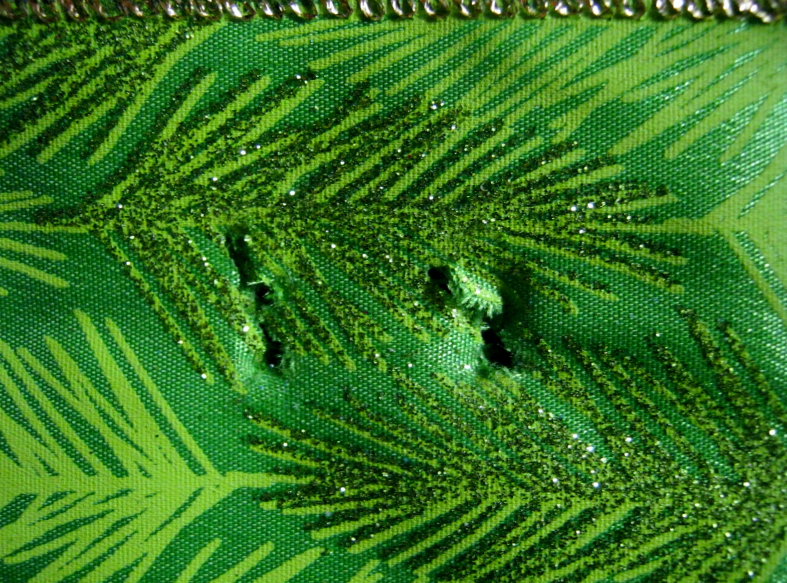
Stenciling, or printing with an object seemed a good idea for a quick border. Outdoors on my lawn lay exactly what I needed, fallen leaves from my Bald Cypress tree. I also gathered a few ‘holey’ oak leaves while walking around the neighborhood. More on that later.

The Color Shift paint worked perfectly. Fluid enough to fill in the lettering without clumping, yet thick enough to dip my Bald Cypress leaves into for printing. (The paint looks a bit faded in this photograph, but it is only intense sunlight beaming across my work area.)

I needed a randomness of mind when I painted the stars. This is an artistic area I struggle with when painting. I find I quickly become uniform in design when painting a large amount of subjects such as stars or dots. The oak leaves came to my rescue and forced me to leave left brain logic behind and create with the bold randomness of the right side of my brain. I used the holes of the leaves to paint the stars. The pattern on the leaves, created by hungry bugs, quickly depicted the scatter of stars I wanted in the background. I’ve used this technique in the past and once again I found success using leaves as a stencil.

I also indulged the child within me and glittered the trees, top to bottom, with glittery balls and stars. The glitter, very fine in texture and easy to use, was found in the local dollar store in gorgeous colors. So much fun. This project was easy and under twenty dollars. The Color Shift paint was a bit pricey, but any other metallic paint could be used in its place.

Photo & Phascination – Abstracts?

In response to The Daily Post’s weekly photo challenge: “Intricate.”

Intricate: what does it mean to you? Show us your interpretation”

oyster 2 cropped

Abstract paintings often appear simple, but in reality can be very intricate in their planning and placement of shapes. The beautiful abstract above, however, is not a painting, but a close-up view of the inner shell of a humble oyster. I find oysters beautiful. Here’s another look at the intricacy of the design uncropped.

oyster 2

Next time you’re on a sandy beach, take a moment to admire an ordinary oyster shell. My husband and I often find instances of pareidolia in the designs of the oyster shells.

“Pareidolia (/pærɨˈdoʊliə/ parr-i-DOH-lee-ə) is a psychological phenomenon involving a vague or random stimulus (often an image or sound) which is perceived as significant.

Common examples of this are seeing images of animals or faces in clouds, the man in the moon, the moon rabbit, and hearing hidden messages on phonograph records when they are played in reverse.

Pareidolia is the visual form of apophenia, which is the perception of patterns within random data.” ~ Wikipedia

And then, of course, there are those amazing pearls…

Painting – Floral Parade Challenge – Magnolias

Photo Courtesy of WetCanvas Library and Duhvinci

The WetCanvas Plant Parade Challenge for March 2015 is the Magnolia.

Photo Courtesy of WetCanvas and Macdragon

These are a few of the reference photographs available for the challenge. You are also free to use one of your own. Any media can be used for the challenge. Please visit WetCanvas and the Floral and Botanical forum for the rules and more information. WetCanvas Plant Parade March 2015

Photo courtesy of WetCanvas and Lady Carol

Project – Christmas JOY canvas

IMG_4354

I love the Christmas canvas art I have seen in stores this year. I decided to create one in favorite colors with a theme word that matches my mood this year – JOY

Here’s a quick step-by-step in pictures.

Choose your canvas size, and three bottles of acrylic paint that are in the same color family. Have on hand paper plates or bowls for mixing, and three foam paint applicators. I used two large-sized applicators and one small one because that is what I had on hand. Next time I create something so large, I’ll make sure ALL my applicators are large.

IMG_4336

I swished the colors on with the applicators, light color, darker color, light on top. I followed no special pattern or design. I wanted the finished color to have a bit of depth, which is why I chose to use three colors. You can use one, two, three or more if you are so inclined. Your choice is what makes the project special.

IMG_4339

At this point I left the canvas alone for several hours to dry. When it was dry to the touch (watch those wet sides when you check it) I Crafted A Bow and tied it off with a piece of floral wire. (I had thirty feet of ribbon for this project) I ran two lengths of ribbon across the front to mimic a tied package. I stapled the ends of the ribbons behind the canvas on the wood stretcher bars, and then with a box cutter poked two holes where the ribbons crossed to insert the floral bow wire.

IMG_4338

IMG_4348

My letters of Joy were next. I used Gorilla glue for this project. If it was a canvas for indoor use I would have used my glue gun. My experience with glue guns is that in cold temperatures the glue releases its hold. Gorilla Glue, although good for outdoors, is touchy too. Here’s a whole youtube video I found on what NOT to do with Gorilla Glue.

Gorilla Glue expands double, maybe triple, beyond where you place it. Beware of this tendency. I ran a very thin line of glue in the center of each letter and put them in place. I let everything dry overnight.

IMG_4346

The next day, using the staple gun again, I attached a string of lights around the edge of the canvas. I had some extra, so I ran that bit up behind the canvas.

IMG_4349

IMG_4356

Hanging it was a challenge. My first choice was on a Shepherd hook. No good! Even stabilized from the ground with string and anchors the canvas caught and swirled in every breeze.

My final solution was the horse hitching post by my front porch. The sturdier, lower post was perfect for hanging. The ears and large pole formed a good anchor for many, many strings. Next year when I hang my canvas, I will think ahead and cover the back to hide the mechanics. But hey, the only people who will see the back are the mailman and those who leave my home. Hopefully, they will stay until dark and not notice!

Painting – November Challenges at WetCanvas

Novemberroygbiv.jpg

I love November’s Challenges at WetCanvas. The November Plant Parade is hosted by Bluemoonstar who says:

“November… here in the Northern Hemisphere, we are finishing up with a lovely fall and both leaves & flowers will soon fade into memories until Spring returns. I was thinking that it would be lovely to see a whole rainbow of color this month . I looked back thru my garden photos and the reference library to find a perfect rainbow of blooms.

The challenge this month is to include a touch of rainbow into your artwork. Use your imagination for its placement- could be in a petal, could be in the background, or somewhere else!

Feel free to substitue one of your own, as long as it fits into the category of “Rainbow hues”. (Hard to miss that target when it comes to flowers, lol).

Remember “Roy G. Biv “? Here we go!

I hope you join our trip over the rainbow this month in search of the rainbow hues that surround us.”

The Chinese Gardens at Montreal Botanic Gardens

1046-Chinese_Gardensmall

The Watercolor Studio November Challenge is of the Chinese Garden in the Montreal Botanic Gardens. Yorky says,

“This month’s challenge give scope for painting reflections and shadows. This is the Chinese garden in the Montreal Botanic garden taken on our tour of Ontario after the Meet this year. I suggest you darken some of the conifers for variation.”

Your artwork in this challenge must be done in watercolors and can be posted to the forum at any time.

Painting – Making Color Charts

I love the look of bubbles, and I want to paint a portrait of my two older grandsons blowing bubbles in my backyard. Where to begin when painting bubbles is the question. There are so many colors within the translucent and delicate orbs. I decided to isolate the colors in the “PAINT” program on my computer. I pasted the bubble picture onto a new document and, using the eye-dropper tool, experimented with a few of the colors. Oh my! Countless shades and colors make up a bubble. It will be quite a challenge to paint them, but I would like to give it a try. Here are the sample color charts I made up using my paint program.

Here’s a closer look at the color charts.

Wish me luck! I’ll be trying to do this in acrylics. I have painted with watercolor for years, but I’m suddenly tired of the time it takes to complete a good watercolor painting, and I am tired of fiddling around with them, trying to get everything perfect. Acrylics are more forgiving of mistakes—time to stop all my chart-making and planning and actually begin painting a picture. SMILE!

Painting – Red Poppies

Here is the finished painting. I opted to change the color of my reference photographs into a brilliant red and black flower with a green-blue center. They are lightly shaded with no shadows. The flowers are a rendition of the Bread Seed Poppies growing in my Square Foot Gardens. Three artists inspired this work. Georgia O’Keeffe for her pure, oversized flower paintings. Vincent Van Gogh was definitely in my thoughts as I created the swirling movement around the sun. Paul Gauguin, Van Gogh, and O’Keeffe are all in my lack of dark shadows. I wanted color, color, color…not distracting blotches.

Kathy’s Poppies – June 2012 – 24 x 34 Acrylics on Stretched Canvas

Follow Me on Pinterest

Painting – Equipment for Acrylics

I have not painted extensively with acrylics, but I have enough experience with them to know that they will dry out and become unusable faster than you can brush them on a craft project or canvas. A good way to counteract this problem is to use a moisture retaining palette. These work great, but as with all art supplies, they can be expensive. The solution: They are very easy to make with inexpensive household and yard sale items.

I found the above Tupperware lunch meat tray for twenty-five cents at a yard sale. I bought a packet of large-sized sponges at the supermarket. As soon as I opened them, and while they still retained their slight moistness, I cut them in half lengthwise, and then into smaller pieces and fitted them to the tray. (A serrated knife works best) I filled the bottom of the tray with a small amount of water and then cut pieces of tracing paper to size using the lid as a template. Along with tracing paper I have used wax paper. I have read other artists and crafters use freezer paper with good results

At this point I placed the tracing paper on top of the sponges and lightly sprayed it with a coating of water. The tracing paper, or other suitable papers, acts like a wick and keeps the acrylics moist. To give myself even more time to work I also added a touch of acrylic extender to the paint before I began to stroke it onto the canvas.

This technique worked perfectly for me. The paint stayed moist, and when I was finished, I placed the lid on tightly and the next morning the paint was ready to be used once again.

For more information on how to set up your own moisture retaining palette for painting and crafting click here:

 Moisture Retaining Palette

Paintings- The Beginning/Poppies

I am redoing my outdoor porch. I want to replace a tattered poster of Van Gogh’s Irises that graced the inside wall for years. I am hoping to paint a large acrylic canvas using my bread seed poppies as the inspiration. I have removed all the color from my reference photographs and used the “Find Edges” filter to show the outside lines. I have enlarged them to fit the copy paper.

I printed seven of these along with several pictures of pods to lay on the canvas in hopes of developing a perfect composition. The pod copies are large enough, but I think I have to make another attempt with the poppies. I want more of the canvas to be covered by the blooms and also have some overlap. I’ll update the progress.